Table of Content
The e-commerce game's changed, merchants. Now it’s all about juggling customer experience and revenue like a master wizard, and mastering the art of payment and delivery options could be your secret weapon.
Just think about it; Checkout is the last hurdle for customers before a merchant throws confetti and shouts, "Woohoo!" But outdated, irrelevant, or unengaging payment and delivery options can turn that confetti into a sad, soggy smog. That's why studies show personalized payment selections can boost sales by a whopping 30%!
And delivery? It's like the emotional roller coaster of e-commerce. Offer not just lightning-fast but reliable delivery, and customers start soaring. Make them wait or rethink, and they're plummeting face-first into disappointment. That's why knowing when to "customize" certain options is key. It's not about being sneaky, it's about making sure the checkout flow is as smooth as the flowing breeze.

Luckily, Shopify gets it. They've got a toolbox of options for customizing your checkout game, and apps like Checkout ShipPay take it to the next level. We're talking granular control, personalized experiences for every customer type – the whole shebang.
So, buckle up, Shopify merchants, because we're about to dive into the magic of checkout customizations via Shopify Functions. We'll explore how hiding, renaming, and reordering payment and delivery options can make your customers do cartwheels of joy and send your conversion rates off the charts. We'll talk about building loyalty, thriving a Shopify store, and turning your e-commerce game into a cash-register symphony.
Ready to unleash the power of Shopify checkout customization and watch your business transform? Let's unravel this together! First off, let’s discuss why you should customize your payment and delivery options.
Reasons To Customize Your Payment Options (Hide, Rename, Reorder)

Forget one-size-fits-all checkouts! It's time to cast a spell on your payment options and create an experience that whispers "enchanting" to every customer. Here's how customizing payment options (hide, rename, reorder) can transform your checkout into a conversion-boosting masterpiece:
1. Trust & Transparency Tonic: Too many unfamiliar payment options can trigger security concerns, casting a shadow on your brand. Banish those doubts! Highlight the most secure and popular gateways, like Stripe or PayPal, showcasing your commitment to data protection and building trust like a seasoned alchemist. Remember, 17% of online shoppers abandon carts due to security concerns – a simple potion of well-chosen payment options can banish those anxieties and improve conversions.
2. Personalization Potion: Unleash the power of customer data! Analyze purchase patterns to identify your audience's favorite payment methods. Hide the less popular ones, like the tedious deposits, and prominently display the preferred options, like Digital Wallets. This personalized approach speaks directly to their habits, making checkout a breeze and boosting transaction success.
3. Mobile-Friendly Marvel: For mobile users, a cluttered checkout is like a cramped stage for a grand delusion. Make their experience smooth and swift by hiding methods less compatible with smaller screens. Prioritize the most relevant options, like Apple Pay, and watch conversion rates rise like a levitating coin. Remember, mobile commerce is booming – optimize your checkout for these magical devices!
4. Global Clarity Charm: Payment method names can vary across borders, casting confusion upon international customers. Speak their language! Rename options with consistent names across locations, like "Wire Transfer" instead of "Direct Bank Transfer." This simple spell removes misunderstandings and guarantees a smooth checkout for everyone, from Paris to Tokyo.
5. Niche Market Mantra: Cater to unique audiences like a sage! For tech-savvy customers, rename "Credit Card" to something like "Secure Mastercard" aligning with their interests and building a stronger connection. This personalized touch speaks directly to their preferences, making them feel like valued patrons.
6. Brand Harmony Symphony: Your online store is an orchestra, and every element, including payment options, needs to play in harmony with your brand. Conduct payment method names to fit your voice and tone, like "EcoPay" for a sustainable brand. This consistent messaging strengthens your brand image and builds trust with customers who resonate with your values.
7. Jargon-Banishing Elixir: Technical terms can be like cryptic spells, confusing non-tech-savvy customers. Simplify and rename options like "ACH Transfers" to "Secure Bank Transfer," removing apprehension and instilling confidence. Clarity is key to building trust, and this simple spell makes your checkout a welcoming haven for everyone.
8. Transparent Payment Talisman: Be upfront and honest about your payment options! Clear and descriptive names, like "Credit Card" or "Debit Card," empower customers to make informed decisions and feel secure about their purchases. Transparency is a powerful element that builds trust and boosts conversions.
9. Decision-Making Chalice: Too many options can overwhelm customers, leaving them frozen & cold. Simplify the checkout process by carefully rearranging payment methods. Place the most popular options, like digital wallets, at the top, guiding customers toward their preferred choice and making checkout a quick and satisfying experience.
Remember, customizing payment options isn't about trickery. It's about creating a checkout experience that's delightful, transparent, and tailored to your customers' needs. So, grab your wand of personalization and start weaving your checkout magic!
Reasons to Customize Your Delivery Options (Hide, Rename, Reorder)

Kick aside generic delivery options! It's time to customize your Shopify checkout with transformative charm and create an experience that resonates with every customer. Here's why hiding, renaming, and reordering your delivery options hold the key to unlocking checkout success.
1. VIP Exclusives: Got a delivery option so good it’s practically rewarding? (P.S. Same-day delivery!) Keep it visible only for your most loyal customers! Unveiling exclusive perks cultivates loyalty and makes them feel like true VIPs.
2. Branding Bloom: Want your checkout to be a seamless extension of your brand's personality? Hide, Reorder, or Rename options that match your brand value, creating a cohesive and on-brand experience that delights customers. For example, if you’re a jewelry brand you can rename Standard Shipping to Sparkling Shipment.
3. Competitive Advantage: In a crowded market, your unique delivery strategies are your secret spells. Keep them hidden to prevent copycats and maintain your edge, enchanting customers with your exclusivity. (You might wanna add a buy online and pick up in-store option).
4. Conversion Enchantment: Confusing delivery options often lead to abandoned carts. Hide irrelevant options and highlight those that best suit your customers' needs, guiding them toward the perfect solution and boosting conversions like magic.
5. Upsell Alchemy: Want to subtly nudge shoppers towards higher-value options? Reorder delivery options to showcase faster or more premium deliveries without being pushy, enchanting customers with effortless upgrades.
6. Transparency Triumph: Build trust by being upfront about delivery option costs and limitations. Hide unavailable options and rename existing ones to accurately reflect their features, ensuring a clear and honest checkout experience.
7. Personalization Potion: Cater to different customer segments with tailored delivery options. Hide express delivery for budget-conscious shoppers and rename standard shipping to "Thrifty Transit" for a playful touch, creating a checkout experience that feels uniquely personal.
8. A/B Testing Wizardry: Don't settle for guesswork! Experiment with hiding and reordering options to discover what resonates best with your audience, constantly optimizing your checkout for maximum conversions.
9. Customer Delight Architect: Craft a checkout experience that sparks joy from start to finish. Hide frustrating choices, rename options for clarity, and reorder them for ease of use, enchanting customers with every step of their journey.
10. Frictionless Flow: Streamline the checkout process by removing unnecessary distractions and guiding customers toward the ideal delivery options. This creates a seamless and satisfying experience that encourages conversions and builds loyalty.
Remember, customizing your delivery options isn't about creating illusions. It's about taking control of the checkout narrative, building trust, and ultimately, boosting your business's enchanting appeal.
Now let’s dive into how you can customize Shopify checkout for payment and delivery options.
Ways to Customize Payment & Delivery Options at Shopify Checkout Using A Third-Party App
Feeling overwhelmed by a checkout overflowing with payment and delivery options? Yeah, been there, done that. It's enough to send your customers packing (pun intended) before they even finish their orders.
But fear not, Shopify merchant! There's a secret weapon in the Shopify app store called Checkout ShipPay, and it can help you customize those payment and delivery options like a master tailor with a magic needle.

With Checkout ShipPay, you can customize Shopify checkout with the following, applicable for payment and delivery options:
- Hide
- Rename
- Reorder
Just add the handy app to your store now, and with a few clicks, boom! You've transformed your checkout from a confusing maze into a streamlined masterpiece. Your customers will breeze through like a ninja on a mission, happy and unburdened by delivery dilemmas.
How To Customize Payment And Delivery Options
Once you add Checkout ShipPay to your store, you will have to choose a plan that allows you to customize just payment (Basic), just delivery (Advanced), or both (Plus).

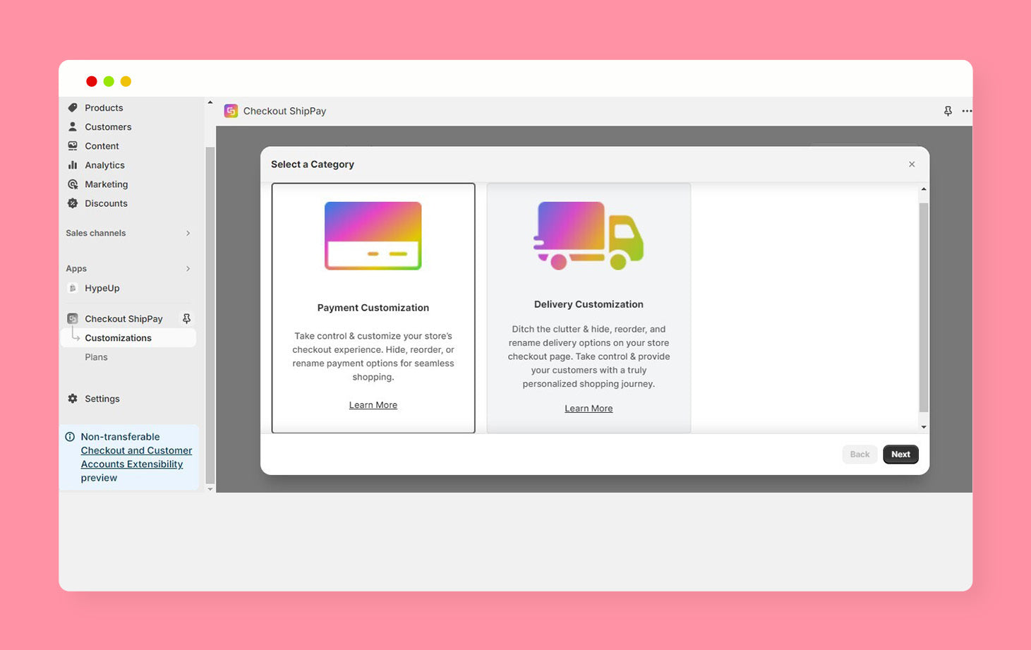
Once you choose your desired plan, you will be taken to the app's dashboard where you have to click on Create Customization and choose from either Payment Customization or Delivery Customization.


You will then see a dashboard where you will have to choose your desired customization option from Hide, Rename, or Reorder.

After that, you will see a dashboard where you can set the title of your customization and choose from the conditions you wish to apply. The conditions include:
Cart Details
- Subtotal Amount
- Total Amount
Product Details
- Product Vendor
- Product Title
Customer Details
- Customer Lifetime Spending

Do note that for all payment and delivery options, you can choose the options you want to customize using 4 filters which comprise of:
- Exactly Matches (Will hide the option exactly matching the phrase you type)
- Contains (Will hide all options that contain a specific phrase you want)
- Does Not Contain (Will hide all options which do not contain a specific phrase you want)
- Does Not Match (Will hide all options except for the one you want to show)

Once you choose your desired customizations, navigate to the upper right-hand corner of the page and change the status from draft to active and click Save.

Voila, happier customers are now yours!
Of course, with great power comes great responsibility (don't worry, not the Spider-Man kind). Remember, the app shouldn't mess with your Shopify store's look or feel, and it definitely shouldn't leave your customers feeling lost at sea. Keep things clear and user-friendly, like a smooth sailing experience on a luxury yacht.
But if you use it right, customizing your payment and delivery options can be a game-changer. So go forth, customize your checkout with confidence, and leave your customers saying, "Wow, that was easy and exactly what I needed!"
Bonus tip: If you do customize some options, add a quick explanation so your customers know what's up. Think of it as a friendly map, not a cryptic treasure hunt.
Ready to give your customers the happiness they deserve? Visit the Shopify App Store and add Checkout ShipPay to your Shopify store now!


