Table of Content
In the world of e-commerce, the checkout process holds a pivotal role, symbolizing the transition from a mere browser to a confirmed purchaser. Shopify, as a company, is deeply dedicated to enhancing this crucial step, aiming to ensure it's as seamless and user-friendly as possible. Previously, Shopify had already developed the most efficient checkout system in the online landscape, surpassing competitors with an impressive 36% higher average conversion rate.

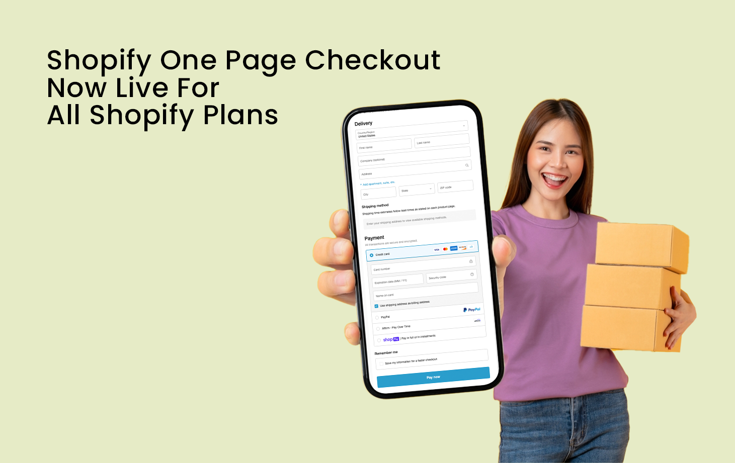
Today, Shopify has taken a step forward by introducing a redesigned checkout system, which is not only more concise and speedy but also more intuitive. This updated checkout process consolidates all necessary steps onto a single page, streamlining the customer's journey. Behold the Shopify One Page Checkout.
Initially released for Shopify Plus stores in Shopify Winter 23 Editions, Shopify one-page checkout represents a design approach where the entire checkout process unfolds on a single page. It offers a convenient and streamlined method for customers to finalize their purchases without the need to navigate through numerous pages or forms. The Shopify One Page Checkout, as of October 2, 2023, is now live for all Shopify plans, and all Shopify non-Plus merchants will be automatically migrated.
Through the Shopify one-page checkout, customers can seamlessly access their shopping cart, input payment details, furnish billing and shipping addresses, and select shipping preferences all within a single, cohesive experience.
Advantages of Shopify One-Page Checkout

Simplified Checkout Procedure
One-page checkout offers a notable benefit by simplifying the checkout procedure for customers. It effectively eliminates unnecessary steps and form fields, saving customers valuable time. Moreover, customers can easily modify and update their information on a single, seamless screen without the inconvenience of navigating back and forth.
Decreased Cart Abandonment
By minimizing the number of steps and reducing loading times, one-page checkout minimizes distractions, enabling customers to complete their purchases swiftly and, ultimately, decreasing cart abandonment rates.
Enhanced Conversion Rates
Shopify's One-Page Checkout optimizes the buying process by eliminating the need for customers to navigate multiple pages, resulting in a focused and intuitive experience. Studies have shown that simplifying the checkout process can significantly boost conversion rates, as customers are more likely to complete their purchases. However, it's important to note that the impact may vary depending on your product or industry.
Efficient Processing
Time is of the essence in the fast-paced world of online shopping. With the Shopify One-Page Checkout, customers can swiftly review their order details, provide the necessary information, select shipping and payment preferences, and finalize their purchase much faster compared to multi-page checkouts.
Improved User Experience
Delivering a seamless and hassle-free shopping experience is paramount for customer satisfaction. Shopify one-page checkout ensures a smooth flow, enabling customers to effortlessly input their information, review their orders, and complete their purchases. This simplicity contributes to a positive user experience and fosters customer loyalty.
Mobile-Friendly Design
Given the increasing significance of mobile commerce, having a checkout process optimized for mobile devices is essential. Shopify's One-Page Checkout is designed to be mobile-responsive, ensuring that customers can easily navigate and complete their purchases on any device, enhancing the overall mobile shopping experience.
Drawbacks of Shopify One-Page Checkout
Reduces Page Loading Speed
Shopify one-page checkout involves the inclusion of a substantial amount of information on a single page, potentially leading to slower loading times.
May Overburden Customers
Despite its reduced number of steps, consolidating all fields onto one page may overwhelm users with an excessive amount of information, potentially causing frustration. This frustration can be further fuelled by the need for extensive scrolling in Shopify's One-Page Checkout.
Poses Analytical Challenges
As all information is condensed onto a single page and within a single URL, tracking and analyzing various elements and resources becomes challenging. Consequently, this complicates the task of website developers in pinpointing the exact stage at which customers abandon their transactions and collecting insights for future improvements.
Is One-Page Checkout Superior to Multi-Page Checkout?

There's a common misconception that one-page checkout is universally better, but in reality, the effectiveness of checkout options varies across businesses. While one-page checkout can be a great fit for some, others might find that multi-page checkout leads to higher conversion rates.
The suitability of a one-page checkout often depends on factors like the target audience's age, the average order value (AOV) of products, and the type of traffic (e.g., mobile or desktop). Additionally, different regions have varying preferences for checkout speed. For instance, some areas like North and South America tend to favor swift checkouts, while countries such as Japan and Germany tend to take their time and carefully consider each step.
The standard multi-page checkout on Shopify typically consists of four steps: gathering customer information, choosing shipping methods, selecting payment options, and displaying an order confirmation or thank-you page, which provides opportunities for post-purchase upselling.
To strike a balance between one-page and multi-page checkout, a hybrid approach is available through express payment methods. Platforms like Gymshark's Shopify checkout offer one-click payments using popular options such as Shop Pay, PayPal, Google Pay, Apple Pay, or Amazon Pay. This allows customers to skip most of the checkout process by logging into their existing accounts, combining the convenience of one-page checkout with the efficiency of express payment methods.
Ultimately, the choice between one-page and multi-page checkout hinges on your specific business segment and the level of optimization in your checkout process. It's crucial to avoid overwhelming one-page checkouts with excessive information and fields, as this can harm the user experience. Strive for a streamlined and optimized checkout flow to ensure a seamless and conversion-friendly experience for your customers.
Best Examples of Shopify One Page Checkout In Use
Semi-Exact
Semi Exact is a USA-based furniture store specializing in steel furniture. Below is their implementation of the Shopify One Page Checkout process.

Design House Stockholm
Design House Stockholm is a company that specializes in Scandinavian designs. They provide furniture, home decor, and kitchen items. Below is their implementation of the Shopify one-page checkout.

How To Implement Shopify One-Page Checkout

To activate the new checkout, follow these steps:
1. Navigate to your Shopify store admin and go to "Settings" > "Checkout."
2. In the checkout settings section, you'll find an informative banner about the upcoming auto-update. Click on the "Update checkout now" button to initiate the change. Alternatively, you can preview the new one-page checkout by clicking the link provided.
3. After the update, thoroughly test your store's new checkout experience.
During testing, pay special attention to the messaging. Some labels that made sense in the old version may now appear differently. Additionally, if you've been using a custom header background to display extra content, you might need to redesign it to align with the new layout.
How To Keep The Traditional Multi-Page Checkout
Regrettably, it appears that all non-Plus plans will no longer have access to the traditional multi-page checkout option following the automated migration on October 2, 2023.
However, Shopify Plus merchants can transition between One-Page and Multi-Page Checkout Formats in Shopify Plus:
For Shopify Plus merchants utilizing checkout extensibility, a straightforward process for switching between the one-page and multi-page checkout layouts will be available through the theme editor.

Just follow these steps:
- Log in to your Shopify Plus store admin dashboard.
- Navigate to Settings > Checkout.
- Select Customize.
- Scroll down to Checkout Layout and choose One Page Checkout.
- Proceed with customizing your one-page checkout.
Best Practices For Implementing Shopify One-Page Checkout
Simplify Form Fields
Minimize the number of required form fields to reduce customer effort and friction during the checkout process. Only request essential information necessary for completing the purchase.
Upsell & Cross-Sell Personalized Product Recommendations
Optimize your checkout process with personalized upselling and cross-selling using the Dynamic Checkout Customizer Shopify app. By presenting additional complementary or upgraded products to customers during checkout, you enhance their shopping experience. This strategy also increases your average order value.

Our client, Fame On Central saw a 20% boost in average order value through personalized product recommendations.
Streamline Shipping and Payment Options
Offer a concise selection of shipping and payment methods to ensure customers are satisfied with the right choices. Display popular and trusted options prominently for faster decision-making.
Optimize Load Speed
Ensure that the checkout page loads quickly to prevent customer frustration and abandonment. Optimize images, minimize scripts, and leverage caching techniques to enhance page performance.
Test And Iterate
Implement A/B testing to assess the effectiveness of your One-Page Checkout. Continuously analyze metrics, such as conversion rates and cart abandonment rates, and make iterative improvements based on customer feedback and behavior.
Conclusion
Shopify One-Page Checkout offers a simplified and streamlined approach to enhance the checkout process for your e-commerce store. By reducing friction, improving user experience, and boosting conversion rates, this checkout solution can significantly contribute to the success of your online business.
However, it's essential to consider the specific needs of your business, optimize the checkout page, and continuously monitor performance to ensure a seamless customer journey. Embrace the power of Shopify One-Page Checkout and unlock the potential for increased conversions and satisfied customers in your e-commerce endeavors.


